Behind the Rebrand
From The Broccoli Report to Sticky Bits.
Friday, September 8, 2023
Time to read: About 9 minutes. Contains 1,945 words.
When Broccoli’s founder, Anja Charbonneau, and I agreed to separate the Report from Broccoli, I already had the name “Sticky Bits” rolling around in my brain. It was originally a contender for a name for the “High Finds” section of Monday newsletters. I considered many other newsletter names and got excited about riffs on news station acronyms—something like “LY42 News,” which only sort of worked when I said it in a 1960s newscaster voice in my head—but Sticky Bits was…the stickiest. Then came the hard part: the visuals.
Broccoli didn’t require me to change things up visually, but it was important for me to mark this new chapter with a fresh logo and look for the newsletter. It was a little exciting, too—my first ever design project that was all my own, my own vision. I just had to figure out what that vision was exactly. Fortunately, when I reached out to designer Alice Du, she was willing to work with me to get there, regardless of how obviously inexperienced I was with being a design client.
As you can see, the end result was fantastic. However, were I to do things again, I would most certainly do a few things differently. Today’s newsletter outlines my experience and lessons learned, useful terminology that streamlined our communications, and advice from other established designers on what makes and breaks the most productive client relationships.
The Brief
It started with a quick temperature gauge over Instagram—we knew each other through her work for Broccoli over the years—and then I wrote out a fairly detailed email outlining the rebrand at hand, the specific assets I sought, the extent of my very moderate budget, and the hopeful timeframe.
Logo for Sticky Bits. I knew I wanted to reflect the OG Broccoli Report heritage in this visual; progress from the 1980s news channel logo/retrofuturistic tech vibe of the Broccoli Report into other ‘80s-reverent, video game-y space.
A visual to accompany the launch, depicting hands rolling a joint with sticky, glittery bits all over the fingertips.
We hopped on the phone later that week to more deeply discuss what I wanted and review the design inspo (basically two Google Docs where I’d collected various images and logo samples I liked), and we were off to the races.
Early Back and Forth
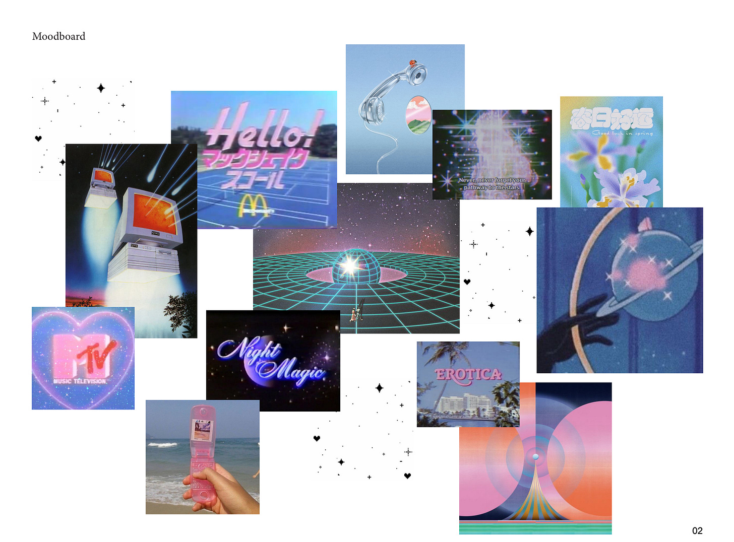
First, Du took our conversation and the limited references I provided and started to flesh out a broader mood board for the look and vibe. She sent me a set of relevant Tumblr and Flickr pages and asked me to call out what felt on brand for the Sticky Bits world. These ones rang the most true with my vision, which was still coming into focus.
The next day, she shared this mood board based on the discussions so far and included nine ideas for “typeface”— which, I learned, means font, in designer-speak. By this point, she was catching on to what I was seeking and described the direction as: “Vaporwave. Think fuzzy on-screen type, Saturday morning cartoons, dreamy sparkles, retro-future technology vibes.” We were getting closer!
A Breakthrough
I didn’t really vibe with any of these fonts, though. Within the week, she sent over another round of typeface (read: font) options, and they still weren’t hitting what was floating around in my brain. The problem was that I didn’t know how to describe what I was visualizing. Here’s when my semi-designer partner came in and played a game of “this or that” with me. He literally pulled up dozens of logos with the vaporwave look and asked me to pick A or B, and by the 10th round, I had a much clearer idea of what I wanted.
Here is where I learned the difference between “type” and “treatment.” Type = font; treatment = the color/outline/artsy vibe giving those letters personality. It clicked that I wanted a bold, straightforward, trustworthy type with a vibe-y vaporwave treatment, also referred to as “texture.” That realization made complete sense to Du, who took the development and ran with it. Less than two weeks later, she made a Zoom meeting for us to review the next round. A round so good that it made me change the deliverables entirely.
Where We Landed
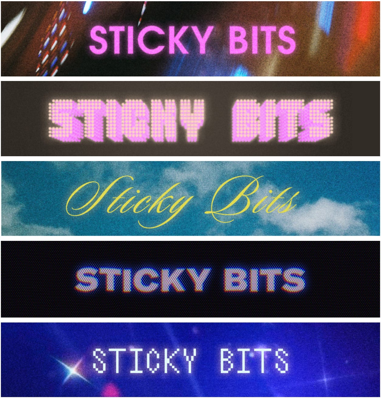
Knowing how I wanted the logo to sit in a sort of horizontal banner at the top of every newsletter, Du filled the space unexpectedly with cool backgrounds to give life to the simple, bold type. All kinds of backgrounds—ten concepts altogether.
She pointed out that a newsletter is an interesting opportunity, design-wise, because you aren’t using visuals to entice them to open it. They’re already here—you get to surprise them with a reveal. She asked, why just one banner when you could rotate multiple? It opened my mind, and I warmed to the idea. I decided to drop the other ask for a Sticky Bits visual of sticky bits of weed on fingertips and instead have her custom-tune a set of banner logos I’d be able to work with.
After three more rounds of small tweaks to narrow down ideal colors and types, I settled on one type across all the treatments and textures for a sense of continuity between the different banners and picked my hero banner to get Sticky Bits established.
I love where we landed, and we landed in a totally different place than I expected. The process went really smoothly on my end; however—for all I know, I was frustratingly vague and annoyingly unprepared. So, I asked Du flat out how typical this process was from other projects.
Keep reading for her candid answer, what I’d do differently now, and what other designers say are the best ways clients can prepare for a project (and the mistakes that waste everyone’s time and money).
Keep reading with a 7-day free trial
Subscribe to Sticky Bits by Lauren Yoshiko to keep reading this post and get 7 days of free access to the full post archives.


